Add to Technorati Favorites

Friday 31 August 2007

No man is an island...


Well, it was going to happen sooner or later - I'm finally going back to the island! I really can't wait - I'm getting so homesick right now, and I'm missing everyone out there so much! There's a huge part of me that's so relieved that I have a date to go back home - I arrive back in Ibiza at midnight on the 18th of August. I just want to run round and use exclamation marks at the end of every sentence! Nothing is getting in my way of that small pleasure! Nothing!

Of course, I've just had the normal run-down from my Dad about the whole thing - until now he was forcing me out of the house into a cardboard box on the streets of Leeds. Suddenly he's all "What's wrong with living here?" and "Are you sure you're going to be ok in Ibiza??" - errm. I think I've lived out there long enough already to be able to be ok, thanks Dad. Everybody seems to be acting really surprised about the whole thing, like they expected that I'd got Ibiza out of my system already, and now I'd settle down, get a mortgage and have 24 kids or something. Sorry to disappoint you everyone, but I can't do that right now. England is doing nothing for my happiness right now, and I'm sorry to say, but Ibiza was my home (and will be for as far into the future as I can see right now), and has been since the day I got there.

I'm not entirely sure how things are going to work out on the island just yet - I know it's the off-season, but I've got enough web design work to be getting on with, so hopefully that will keep me going for a little while at least. I hope so anyway, because I've just bought myself a brand spanking new laptop. My old one is falling to pieces, and I really want to be able to mess around on Ableton again, and be able to have more than 2 plugins going at the same time, it's kinda limiting me right now. That and the fact that my laptop's power supply feels like it's going to blow up at any moment, and I've normally got a pretty good feeling about these things.

I actually really like the island off-season. There's no tourists for a start, which means you can pretty much have the beach to yourself. Also, a lot of the locals don't work through the Winter, which means that everyone ends up at each other's houses watching House, and anything else English on the FX network.

Things I'm missing about the island:
  • All the usual suspects (in no particular order) - Jimmy, Krystle, Ben, Donald, Milena, Linda, Janey Pie, Tamara, Lucky, Andy, Havier, and all the rest of them.
  • Never knowing where you're going to be at 6am.
  • Hash
  • Sun rises
  • The beach
  • Staying in to keep cool, not to keep warm
  • Cheesy Spanish Telly
  • Shops that are just a front for selling drugs
  • Walking everywhere
  • Seeing everyone you know even if you just pop out to the shops for a croissant (a 2 minute walk generally ends up taking about half an hour)
  • Pacha (there's so much I miss about this place - the funky room, Subliminal Sessions, Vaugn, the anticipation of getting dropped off in the taxi outside, coming out and finding it's light outside, the walk home, the woman selling chupachups in the toilets...)
  • Bar Sin
I could go on and on and on, but I'm going back there in 2 weeks! Yayayayayayyyyyyy!!!!!

Saturday 18 August 2007

Jim's enquiry bell please.


I had a bit of a break from work this week because I went to London with Marisa to see one of her favorite bands, Tegan and Sara. We got up at the ungodly hour of 11am, and blinking in the bright light of gloomy countryside england we tried to haul ourselves out of bed. After the usual interrogation from Dad ("Where are you going??" "Why??" "I expect you'll be taking lots of drugs?" - my Dad has a really high opinion of me.) we drove bleary-eyed down to Ilkley Station in the party wagon.

On the train down to London, we experienced the most amazing feat of all that is Woman - a knitting competition between some old biddy that looked like a a man, and this lass who looked like she was about 5, bless her. The old biddy was seriously going for it - I'm not sure what it was she was knitting, but I don't doubt it was some amazing device to counter terrorism against the Western World. In the event of World War III, I have no doubt that we can just get all the old biddies in the country to knit a protective shield for the country out of teflon wool or something. I was so intrigued by her arthritic dexterity that I filmed her for a good few minutes through the gap in the seats. This wasn't even the best part of it, later on she started dispensing old-people wisdom whilst knitting. There was no stopping this girl, she had it all: style, wit, wisdom, needles, some wool, and more facial hair than me.


It seemed really unfair on the little lass, the biddy just seemed to be toying with her, like a cat plays with a mouse, but little knitter was trying her best to keep up. She did well, and in the great knitting train race, eventually finished 2nd. Well done wee knitting type. I hope one day you, too can achieve flowing golden facial hair and infinite wisdom.


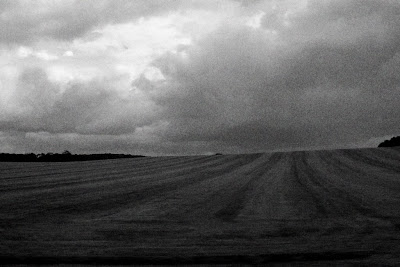
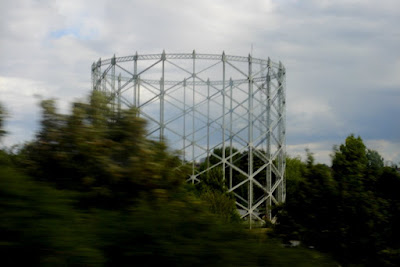
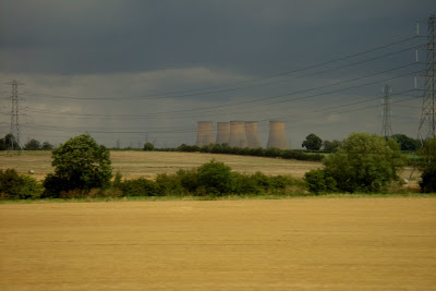
After witnessing possibly the greatest head-to-head knitting contest of all time, I decided to eat my chicken curry baguette, taking the cucumber out first, obviously. Then I took some pictures out of the window of blurred things going past. It filled the time in, and my GameBoy wasn't charged, so I was sulking.


Then I had a nap, while Marisa took pictures of herself. One day I'm going to make an album of all the pictures Marisa has taken of herself on my camera.


I woke up to find I was being acosseted by a dodgy old GNER fanboy who wanted me to buy some crisps off him. He didn't have any prawn cocktail crisps, which seemed a little pants, so I settled for some stupidly salty sea salt flavour crisps. Why would anyone every dream up making a "sea salt" flavour? I mean sea water is possibly the most disgusting thing to have in your mouth ever, so designing a whole flavour of crisps around this fact doesn't seem a very good marketing strategy. You might as well call it "Walkers Sewage Sensations". Yum. I tried to surreptitiously take a picture of the mad old bastard, but he was quite wily in his old age, and had anti-photo cloaking technology on his side, possibly knitted for him by his mother.


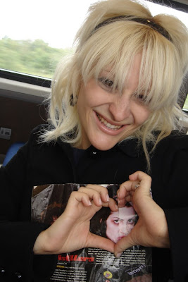
After that, we just had time to take a few pictures of Marisa modeling an article about the Distillers, who looked like they would all order a foot-long hearty Italian crack sandwich if Subway started selling them.


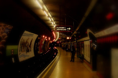
Finally we arrived in London town, and dived into the underground system, trying to find out how to get to Shepherd's Bush land. Using my powers of cunning, I found that by battering a few Londoners, they willingly gave up the closely guarded secrets of the tube system, and soon we found ourselves on a direct train to the Bush.


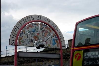
We did what any normal person would do when arriving in the Bush for the first time: we looked around in sheer and abject horror at the total ghettoness of it all. People who until now had appeared like nice librarian types suddenly seemed armed and dangerous. I mean I've stayed in some pretty ghetto parts of the world before now, but I think in many respects I'd prefer to take a South African shanty town over Shepherd's Bush any day of the week. At least they smell better, and they have a roof over their head. Oh, and they don't have to put up with a mobile phone accessory shop (shop is such a strong word in this circumstance - most of them were just a cardboard box with a man sat next to it) every other metre on the street.

After our first foray into the art of getting lost in London, we successfully used Google Maps Mobile to locate our position in the sewers, and found our bed for the night, the very lovely 
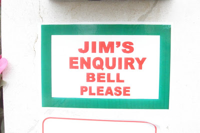
Jim's Shed and Breakfast (or it might just as well have been) - notice on the website it says "Welcome to London's finest"... finest what, exactly? Stable? Dungeon? That would be true at least, the real London dungeons have nothing on Jim's Shed and Breakfast. "Jim" actually turned out to be short for Mohammed, who quickly decided he'd never heard of us, even though we'd paid in full by card before our trip. After 20minutes of waiting around, they found our booking, scribbled on a piece of used toilet paper in the "office" (which was a 20x20cm area in front of the fish tank in the kitchen). Something else I just noticed about the Jim's Shed and Breakfast is the location page: "For a list of all local hospitals and where they are in connection to Jim’s Guest House, visit here." - There's a very good chance that you'll be visiting a hospital after staying at Jim's, so this is useful information to have. Everything in Jim's seemed to be downstairs - the reception, our room, even in the bathroom you had to go down 5 steps to get to the toilet. I spose that way if you miss (I mean like really badly miss) it'll still find it's target eventually.

Jim (a.k.a Mohammed) seemed to be a big fan of motivational posters. I hate these things. Jim's favorite was positioned on the stairs leading to the reception - it read something like "Excellence: Excellence is the difference between doing something nearly right and doing something really right." with a picture of an arrow falling onto the bullseye. The only problem with this is that you don't drop arrows onto a dartboard, you throw them. Any big fat darts player wanting to play darts in a big fat darts contest will get laughed off stage by Jim Bowen himself if he tried dropping the dart onto the board. It just doesn't work that way. If I was into motivational posters, this is how they'd look:


The only saving grace of the room that we ended up in was that it had the bounciest bed in the world. The unfortunate downside of this was that even if you slept directly in the middle, you still felt like you were going to fall off. The centre actually felt worst of all because somehow it made you feel like you were going to fall off in four directions at once - even now I'm still wondering how it did this.

After dumping our crap in the room, we ran out (partly out of curiosity, partly due to wierd animal mating noises coming from under the bed) and deep into the Bush.


As you can see, the Bush rates alongside such holiday destination hotspots as Scotland, and Auschwitz. After buying some cockney caps (2 for £10 from any reputable road-side seller called Ali) so that we fit in (disguise is everything in the Bush), we eventually managed to get in touch with Aaron, who was on a mission in Tottenham Court to get well and truly fucked. We hot-footed it over there on the tube, just because we wanted to get out of the Bush (which was beginning to look more and more like they'd filmed parts of Apocalypto there on location). On leaving the Bush, we suddenly found we were really hungry for anything that wasn't nasty kebab. I'll tell you something, if you ever get a craving for nasty kosher meat, you won't go hungry in the Bush. I'll carry on in a seperate blog post, cos this is getting a little long...

Tuesday 14 August 2007

By the end of my life...

What I really want to be is a walking Swiss Army knife. But a useful one. The problem with Swiss Army Knives is that they have so much potential, but they're never around when you need them, but when you don't need them, they're just everywhere.

Case in point: My horse (well, my hypothetical one, at least) gets something stuck in it's hoof while we're hypothetically out on a hack. A perfect time to whip out my trusty blade, and use the horses hoof picking attachment to heroically dispatch the rogue rock/bit of twig/mine the poor daft mare has stepped on. What actually happens, of course is that while the horse is going crazy-wild with pain, and trampling on every daft old biddy that thinks She can horse whisper it into submission, you realize that you left your 587-function Swiss kit in your other jacket. Bugger. Meanwhile, as She was looking for your packet of fags in your jacket, and going a bit loopy from a nicotine withdrawal, your Sister finds the aforementioned multifunction device and tries smoking the can opener, and dies of blood poisoning because you used the can opener to pick the dirt out from under your toenails last Tuesday. True story. Hypothetically.

What you really need is a Swiss Army knife that will never be parted from your side, with real useful tools. To which end, when the technology becomes available, I want each of my fingers converted to do something other than just holding things.

Here's what I've come up with so far:

  • Right thumb:
    Would make a great bottle opener.
  • Right index finger:
    I'm going to get this finger sharpened, to be used as an offensive weapon, that I can just jab somebody in the heart with if the need arises. Maybe I could have it poison-tipped as well, I haven't decided yet. I'm considering using this pro-actively to kill scallies and smelly old men who hang around Tescos. The way I see it, it's them or me, and with my poison-tipped index finger, chances are, it's them.
  • Right middle finger:
    Screwdriver/egg whisk. It's interchangeable depending on whether I'm making a spice-rack or making a cake.
  • Right ring finger:
    Skeleton key. I always wanted a skeleton key, and if you've got one attached to your hand at all times, you can get into any locked room/car/safety deposit box.
  • Right pinky:
    I'd have extended and straightened so I'd look totally baller while drinking Earl Grey at high-tea. All us English guys drink Earl Grey. It's the law.
  • Left thumb:
    64GB USB Thumb Drive. It detaches, so you can easily steal important documents from unsecured computers no bother.
  • Left index finger:
    Extendable Firewire 2 cable, for interfacing really fast to computers, perfect for one-handed web browsing.
  • Left middle finder:
    I would just have made bigger, for 2 reasons: 1) You can flip people off with style. 2) Girls would love it. Especially if you could hook up some way of converting blood sugar into energy to vibrate it. Yeeeaaahh.
  • Left ring finger:
    Wax crayon. There's never one around when you really need one. Remember those crayons you used to be able to stick all your fingers into different colours and draw crap pictures with? It'd be like that, but attached. It doesn't get better than that.
  • Left pinky:
    Laser spirit level. I'd never actually use it for it's spirit levelling purposes, more for it's blinding purposes (mostly on double-decker buses). In America you could have one of those laser pointer pens, but we're not allowed those in Britain for exactly that reason.
Comments? Suggestions?

Wake Up Your Car...


The website I'm doing for my work at Drive-In is finally starting to come together now, I've just uploaded a test version while the domain is being swapped over, there's still a lot to do, but at least people can get at the information now :) Tell me what you think!

Sunday 12 August 2007

A DJs weekend from hell

I've definitely had better weekends when it comes to DJing! It all started on Friday night - I'd already picked up both the rigs I needed from Rod's house on Thursday, so after work on Friday, all I had to do was drop off the stuff for Ben at his gig in Burley-in-Wharfedale, then race back to Hollins Hall at Guisley, and set up my own rig there.

However, halfway through setting up, Ben phoned me, to tell me that I'd not given him a microphone. Bugger. I got some background music going, then jumped in the van, raced back to Burley, and dropped the spare I had with me off for Ben, only to find that Ben was nowhere to be found, and that there were a load of Emo teenagers pissing about with the rig! I told them off, then raced back to my own gig.

So yesterday, I went back to Burley to pick up the rig with Alice, and just as we're leaving Burley I notice that the "door open" light is flashing at me on the dashboard. I get out and slam all the doors to make sure they're closed, but everything seems to be fine, so I drive on. Then just as we're going up the hill to go home, the boot suddenly opens, and everything spills out onto the road behind us! The speakers seemed to bounce for about 5 years before finally coming to a stop somewhere in Egypt. Bless her, Alice jumped out of the car while we're still moving, and ran to try and get everything picked up, while I parked the car across the road with the hazard lights on to stop these 2 grumpy old men that had since driven up from getting a 1000W JBL speaker-sized imprint in their bonnet. We got everything loaded back in, but found that the catch on the boot had somehow broken, which was why it had come open in the first place, and it wouldn't shut properly. We drove up the hill as slow as possible, and made it home without any incident. Then when I came to open the boot again, the speakers decided to fall out again, one of them directly on my foot, and then went rolling into Alice's knee. I think they have something against us.

From there, it just got worse - I went to set up at my gig last night (a Scottish woman's 70th birthday), to find that only about 20 people had turned up. Just as I was doing a sound check, the woman who'd booked me came up and said "You do have some waltzes, don't you? Only I think the people Betty's age would like that." Greeeaaat. This is gonna be one fun party. I have no waltzes. None. I pride myself on that fact, and to be honest, until this moment, I've never had cause to have any waltzes.

I spent the entire night playing swing tracks to an empty dancefloor. At one point a grand-daughter of the birthday girl asked me for Rhianna - Umbrella, a track which I hate with a passion. But, I figured that since none of the old biddies were requesting anything, I might as well. The younger people in the room instantly got up to dance, but about a minute into the track a miserable old git who looked like he was probably 600 years old came up and started giving me abuse!
"Don't you think you should be playing songs Betty wants?!"
"Well, I've played all the ones on her list, and nobody danced to them, so I thought I'd play this one because the girls asked me for it, is there anything you'd like to dance to?"
"You should fucking know that, you're the DJ!"
At this, he stormed off, to give me evil looks from the other side of the room for the rest of the night, while I was left to play funeral dirges (Danny Boy was a track they'd requested for the event, I ended up playing it 4 times through the course of the evening - if I'd have had a "NOW that's what I call depressing music!" album, they would have been going mental) for the rest of the night, while one daft old man who looked like he'd taken 15 grammes of Ketamine spazzed out on the dancefloor, and had a heart-attack.

To top it all off, because I'd had to put all the equipment on the back seat, when I got home, I couldn't see to reverse, and ended up backing the van straight into the gatepost, pretty much destroying it, and cracking all the brake-lights. Great.

Making a 3 Column Blog

Blogger is great, we all know that - you can have a blog set up and running within about 2 minutes, and it'll look great just using the templates that they provide you with. If you're happy with the way things look then everyone will live in peace and harmony for ever and ever and ever. However, if there's something you want to change about the template, blogger can be a complete nightmare. Yes, everything is styled in CSS, which makes things a little bit easier, but if you don't know what's going on, you don't have a hope in hell of getting things to look the way that you want.

A couple of people this week have asked me how to make their default 2-column blogger template into a wider 3-column template - sounds pretty easy, but we are gonna have to get our hands dirty with the actual coding of the page to make it happen. Before we begin, a quick note: The blogger templates are set up so that they will be viewable on the smallest possible screen size (640x480) and people will not have to scroll horizontally. By increasing your width with 3 columns, the people using this resolution will have to do a lot of scrolling to see your content. However, looking at my stats for the last month for my blog, not one person was using this screen resolution (out of over 5,000 visitors), so this is a pretty moot point.

First of all, a bit of explanation on how the default blogger templates are set up. In order to get everything laid out on the page where they want it, they use Divs, and style them using CSS. Divs are a way in HTML of positioning a block of content exactly where you want it on the page. They're a little like tables, but instead of having to make sure that one table cell takes up x amount of space in order for another to appear in your desired position, with Divs, you can tell it an exact coordinate. Here's a diagram showing the Divs (and their names) on a default blogger template:


These are pretty self explanatory - the only one that may cause a bit of confusion is the outer-wrapper - this is basically a hold-all for all the other information contained within the page, and gives the divs contained within a reference for positioning. The divs will have different dimensions, depending on what default template you've chosen. This is how we want the template to look:

Here is where things start to get messy. The first thing we need to do is increase the width of the content-wrapper so that it can accommodate another sidebar on the left. The default sidebar is generally around 220 pixels wide, so we'll need to increase by this amount. Go into the Edit Template HTML page for your blog (dashboard>layout, then choose the Edit Template HTML tab at the top of the page). Now you need to find the part in the code that controls this outer-wrapper width - in the minima template this is about 1/3 of the way down the page - you're looking for:

#outer-wrapper {
width: 660px;
margin:0 auto;
padding:10px;
text-align:left;
font: $bodyfont;
}

This controls all the dimensions, margins and positioning for all your content in your blog. Some of the settings may be a little different, depending on your template, so don't be alarmed if this is the case. Change the width value to 780px. This is the maximum size width that people looking at your blog will be able to see without scrolling horizontally at 800x600 resolution (you need to allow 20px for the scrollbar on the right). While you're here, below the code you just edited, you'll see a section named #main-wrapper - change the float option in this section to center instead of left, so that it looks like this:

#main-wrapper {
width: 410px;
float: center;
word-wrap: break-word; /* fix for long text breaking sidebar float in IE */
overflow: hidden; /* fix for long non-text content breaking IE sidebar float */
}

This won't change much when people actually look at your page, but it will help you see things the way they're supposed to be in the layout editor. Now we need to change all the other divs so that they will fit with this new width. We'll deal with the header first, and work down. The header code is actually above the outer-wrapper code. This is what you're looking for:

#header-wrapper {
width:660px;
margin:0 auto 10px;
border:1px solid $bordercolor;
}


Again, change the width to 780px (we want the header to take up the entire width of the page). Same with the footer (further down the code):

#footer {
width:660px;
clear:both;
margin:0 auto;
padding-top:15px;
line-height: 1.6em;
text-transform:uppercase;
letter-spacing:.1em;
text-align: center;
}


Change the width to 780px again. Here's where things start to get interesting. The existing sidebar and the div that will contain the main content, we want to keep around the same size, and just budge them over enough to fit in another sidebar div. We need to copy and paste the existing sidebar-wrapper code to make the new sidebar to the left. Find this near the top of your code:

#sidebar-wrapper {
width: 220px;
float: right;
word-wrap: break-word; /* fix for long text breaking sidebar float in IE */
overflow: hidden; /* fix for long non-text content breaking IE sidebar float */
}


Change the width of this sidebar to 200px, then paste your new sidebar code directly underneath this one (it doesn't really matter where you put it, but it helps to keep all the wrappers together so you can find them easily if you need to. Change the values to something like this:

#sidebar-wrapper2 {
width: 170px;
float: left;
word-wrap: break-word; /* fix for long text breaking sidebar float in IE */
overflow: hidden; /* fix for long non-text content breaking IE sidebar float */
}


The float value just tells the div which side of the outer-wrapper to go to, you'll see on the other sidebar that this was set to go to the right. Now that we've set the style for our div, we need to actually create the div itself, so we have to move out of the CSS code block, and down to the HTML block, further down the page. Look for a block starting with this code:

<div id='sidebar-wrapper'>

Above this, paste the code for the new left sidebar:

<div id="sidebar-wrapper2">
<b:section class="sidebarLeft" id="sidebarLeft" preferred="yes">
<b:widget id="Profile1" locked="false" title="About Me" type="Profile">
</b:widget>
</b:section></div>

I've just added the "about me" widget to the left sidebar to give you something to fill the space in the layout editor, for when you come to add other widgets to this area, otherwise you'll have nowhere to drag your widgets to to add them to your new sidebar. You can remove this "about me" widget as soon as you've added another widget to the sidebar. Because you now have 2 "about me" sections, you'll need to delete the one for the right-hand sidebar, otherwise blogger will throw a tiz. Just delete this code

<b:widget id="Profile1" locked="false" title="About Me" type="Profile">
</b:widget>

from the right-hand sidebar div, which should now be just under the code you've just inserted.

All that remains is to copy the styles used for the right-hand side bar to the left one, so that they have a uniform style. Go back to the block of CSS code, and somewhere near the bottom you'll see a section specifically for the sidebar, starting with

/* Sidebar Content
----------------------------------------------- */


Here, you should see 4 or more styles relating to the right-hand sidebar, you need to copy these styles to the new left-hand sidebar by just adding the name of the sidebar to the list these styles apply to. So where you see

.sidebar {

replace it with

.sidebar, .sidebarLeft {

and where a certain element of the sidebar is changed, add the same element to the list for the left sidebar, so you might see

.sidebar ul {

change this to

.sidebar ul, .sidebarLeft ul{

likewise

.sidebar .widget, .main .widget {

becomes

.sidebar .widget, .main .widget, .sidebarLeft .widget {

and so on. Once you've copied all the styles for the right-hand side bar to the left-hand one, you should be pretty much done. You might want to fiddle around with the widths of the elements to make them fit better with your design, but apart from that most things should be fine. I would strongly suggest looking for a tutorial on CSS on the internet so that you understand fully what the code in your template is doing, and so you can edit it to look exactly the way you want it to without fear of breaking the template.

I hope you find this tutorial useful, and leave a comment if you have any problems with this or have a tip regarding this code, we're all here to help each other learn!

Thursday 9 August 2007

How to design a webpage Pt I: Images

Following on from my earlier post How not to design a webpage, here's some tips for people making a webpage/blog/MySpace profile to follow to make things look a little better. I want to cover as much ground as possible, but I'll take things in small chunks, this time I'll concentrate on how to make the images on your site look as good as possible.

  • If you're using an image on your site that was originally a different size to what you're going to be using it at, don't just code the different size into your HTML, use an image editing program to actually resize the image. This is a good idea for 2 reasons: It will look better, as image editing software will resample the image (a bit complicated to explain, but it basically means that your image will end up looking clearer than just giving the image different dimensions in HTML). Also, it will mean that people will not have to download a 1.5Mb image just to see the thumbnail size you've coded into your webpage, therefore the page will load faster.
  • Anti-Alias your images. This is a basic function of most image editors, and makes the edges of text and graphics smoother. This is done at the pixel level, but you wouldn't believe how much of a difference it makes in terms of making your site feel more professional. Have a look at the image below:

  • GIF images are best for images with large areas of solid colour - diagrams and cartoons are good examples of what to use GIF images for. You can only have a maximum of 256 colours in a gif image, but to make your file size smaller, you should set the number of colours in your image to be as low as possible. One of the benefits of using GIF images is that you can set one colour to be transparent, allowing anything behind the image to show thorough, this can be useful, although unless you know what colour is going to be behind your image, it can be difficult to make this look smooth. In this situation it would probably be better to use a PNG.
  • JPEGs are better for photographs - anything where there's going to be smooth gradations from one colour to the next. You can set a level of compression for JPEG images - the more you turn the compression up, the smaller your file size will be, but the more 'blurred' your image will look. JPEG images have no transparency, so they will always be rectangular.
  • PNGs are useful where you need an image to smoothly blend with it's background. This is the filetype you'd get if you cross-bred a GIF with a JPEG. It achieves this smoothness by allowing you to set each pixel to be any one of 256 levels of transparency, from totally transparent (you can totally see what's behind the image) to totally opaque (you can totally see the image). The downsides to this are that the filesizes tend to be bigger because of this, and not all browsers support this transparency effect. Internet Explorer 6 will show the image, but anything even slightly transparent will show as grey. Firefox 1+ and Opera will both show these images correctly, as will Internet Explorer 7. If you've still got IE6, I strongly suggest you upgrade to Firefox.

Daft Searches

It never ceases to amaze me how people end up at my site, using Google Analytics, I can see exactly what people searched for on Google to find me, sometimes you have to wonder what people were actually looking for with these searches - here's just a few of the stranger ones...

  • girls on tractors
    I told you it was a big turn on for some people. This is one of the top searches that ends people up on my blog.
  • naked girls on tractors
    It just gets better.
  • frankie says your gay shirt
    Ahem. Does he?
  • avril lavigne shoes
    Obviously I'm not the only one that wants them. Why stop at the shoes though? They really aren't her best feature.
  • bamboo yellow shoe
    Even the Dutch aren't that daft.
  • blindfolded gang
    I don't ever remember writing that blog - I must have been very fucked up...
  • classy hen do in leeds
    There's no such thing.
  • hiccuping podcast
    Somebody was actually expecting to find a podcast about hiccuping??
  • how to make ninja shoes
    Everyone's after a pair of these bad boys.
  • kidman compass
    It's mine and no-one else can have it.
  • middle age woman feels ugly
    Have a Hen party, everyone else is doing it.
  • mixer+shoe
    There's better ways to DJ
  • naked indian guy
    That was just a rumor, it never actually happened.
  • party threesome leeds gem
    You can get anything on Google these days.
  • shoes tiesto
    More Dutch shoe madness. Those crazy Dutch.
  • shoes to go on your myspace page
    Err. It's a webpage, and therefore not strictly necessary to dress it. It will look crap all season all by itself.
  • sperm on shoes
    Easily done.
  • sugar paste shoes step by step
    ?
  • ugly fat middle-aged people
    Surely you don't need to search on Google to see these? If that's your thing, just come to Leeds.
  • ultra-power gay
    That's a super-hero I hope they never make a comic about. Perhaps you can buy gay electricity now. Gives a whole new meaning to the phrase "turn on the light".
  • washing up as lube sex
    That's just NASTY! Extra points if you can blow bubbles with it though.
  • what biscuits do old people like
    Stale ones.
  • website with nothing but yellow shoes
    There's a market to be cornered, clearly.
I kid you not, these were all things that people have searched for and ended up at my site - that list is only from the last month!

Silly Putty, but painful Silly Putty

First of all, I'd like to thank everyone that's commented on the new design for Yellow Shoes - the general consensus seems to be that people like the new design, which makes me happy, thanks so much everyone :)

This week the blogs have been a bit sparse - first of all I've been dashing round like a blue-arsed fly driving DJ equipment round for Rod, who is not able to drive at the moment, which has meant that I've been dashing round Yorkshire with huge speakers and lights in the back of the van. The only upside to this has meant that I don't have to worry about world war 3 potentially breaking out every time I try and get the keys off my sister for the car.

On Saturday night, after playing at a Wedding in the arse-end of nowhere, I drove back to take over another gig from Rod in a big marquee at the end of my road, and played a pretty blinding House set (even if I do say so myself), and kept the party going all night. It was weird that although the set couldn't really have gone much better, all it did was prove how much I'm missing Ibiza to me :(

On Monday, I started my new job at the garage, where I'm designing the website, and doing engine re-mapping - this is all part of my cunning plan to get myself a new laptop and then get a little place for me and Marisa in the centre of town. The job's ok, but I'm in the grottiest office in the world, currently my only amusement is the fact that the floor slopes down 30 degrees to my desk, and that there's a woodlouse with Wobbly Hedgehog Syndrome trying to get into the light-switch. Sigh. To make up for it, me and Marisa went to see the Transformers movie, which I've been losing sleep over for a long time, I've been so excited about. I wasn't let down - the movie was amazing, and was even genuinely funny (which I wasn't expecting at all). The only thing I was a little disappointed about (apart from the obvious changing of BumbleBee from a VW Beetle to some daft American car) was that the robots changed so fast you didn't have chance to savour the moment, but it really was a minor gripe.

Last night was the one that really stood out though, and not in a good animated talking robot kind of way, either. After Mum going on about it for about 52 years, I finally went to Chai, the Thai Back Guy, to see if he could make my back any better. I can honestly say it was the most painful experience of my life. He made me scream like a little girly at several points in the proceedings, and when he'd finished, I felt dead. Just dead. Today I'm still dead, and my back is still in agony. I don't think I want to see Chai the Thai Back Guy ever again. I want to slap him, but I know he could probably do some Matrix-type kung-fu on my ass, and I'm already dead because of him, so it's probably not worth it. Owwwwwww!

Friday 3 August 2007

How not to design a webpage

While I'm in a designy kind of mood, I thought I'd write a few articles on web page design. Now I'm not professing to be the best designer in the country or anything, but I do know what works and what doesn't, so first of all here's a few tips on what not to do when designing a web-page. These are things most commonly done by people making their very first web-page or blog, and go overboard with everything, which invariably results in a nasty, unreadable mess. Some people still do this when making web-pages, after years of doing it.

  1. Animated GIFs
    When considering using any kind of animation, you should think about what it's actually going to add to the design of your site. 99 times out of 100 including an animated GIF in your site design only serves to make your design look cheap and tacky, and draws the readers focus away from the actual content of the site. Likewise with any image you use on your site, it should be there only if it lends extra context and understanding to your content. You can do a lot without any images at all these days - just look at the "Minimal" designs for blogger - a great example of really good design without using any images at all.
  2. Frames
    I can't remember the last time I saw a commercial site that used frames, but there's still a lot of personal sites that use them. Frames were really popular in the late 90's, and everyone was using them at this time. They allowed you to split your content up into areas, some of which stayed permanently on screen while the reader scrolled through the main content. If you really want to split your design up into areas that don't scroll, it's much better to do this using CSS and DHTML, this way search engines point you to the exact page needed, and your users are not left floundering without any navigation links. If you really have to use frames (and I can't think of a single instance where you would), include a script so that if a page is loaded from a search engine, and doesn't include it's navigation links, the page gets reloaded with them. This is not hard to do, and not including a script of this kind is just plain lazy.
  3. Page Counters
    I don't want to see that your page has had only 20 people visit it, that doesn't fill me with a lot of confidence. This is information only you, as the page designer needs to know. You'd be much better off using a stats website like Google Analytics, which will give you a better picture of who visits your site, where they are from, what browser they use, among a million other things.
  4. Unreadable Text
    What's this all about?? I've never once understood the need to give your page a white background and yellow (or lighter) text. If you use a background image, make sure that you set the bgcolor property of <body> to the colour closest to the background image. This will make it so that people who've chosen not to see background images can at least still read your text.
  5. Nasty Background Images
    While we're on the subject of backgrounds, if you're going to have a background texture behind your text, make sure people can still read your text. There's nothing worse than having a stupidly complicated background image and having to decipher the text through it. Even worse: animated backgrounds - just don't do it.
  6. Really Wide Pages
    Make sure the part that will contain the main content of your page will end up being no larger than around 600 pixels wide. Keeping track of what line of text you're on becomes more and more difficult the longer the line is. Look at just about any book published throughout history, and you'll notice they keep their line width quite thin for this very reason. Also the further your eyes have to scan from left to right, the more tired they will become.
  7. Slow loading times
    This is generally down to large or un-optimized images on the site. People will not wait forever for a page to load, and generally will navigate away from your page if they can't find what they're looking for within 10 seconds. Where possible, try and make sure your text loads before your images, this way people will at least have something to be keeping them occupied with while your images load. Optimize your images as much as possible so that they still look fairly decent, whilst taking much less time to load. My favorite program for Image Optimization is Adobe Fireworks, but Photoshop is also good these days.
  8. Bad Navigation
    I want to be able to find the information I want as quickly as possible, and so does everyone else. If you have a lot of content on your site, split it down into logical sections, (You should try and keep your site to between 6 and 10 main sections)and offer a search function. Don't hide your navigation away in the design - it needs to be obvious to people how to get from one area of the site to another. This is one area where even big sites fall down (MySpace is notorious for it).
  9. Too Much Advertising
    The more advertising people see on your site, the less people want to stick around. If your site has advertising, it should not get in the way of the content - after all, that's what people are there for - they don't come to your site to look at adverts, even if this is what you'd prefer they do. AdSense spamming (putting AdSense advertising all over your site) is frowned upon by Google, and you'll end up with your account deleted if you do this. Pretty much everyone has pop-up blockers these days - pop-ups are annoying and they don't work.
  10. Hyperlinks
    There's a lot I can say about Hyperlinks - for a start, your links need to stand out from the rest of the text, or people won't know they're links. Keep your links blue if at all possible - people expect links to be in blue. You don't need to say "click here" every time you put a hyperlink - people know how to work them - just link the relevant text. And keep the site you're linking to relevant as well - I should know what content to expect before I even click the link just based entirely on what words you've made a hyperlink.

Spangly...

Those not looking at Yellow Shoes on an RSS Feed will hopefully have noticed I've brought the new design into play - there's still a few kinks I need to work out, and I have to put all the sidebar items back to how they were (swapping the design over got rid of them all. Damn blogger! Still, at least blogger lets me play with the design to my heart's content. It makes me happy.

Thursday 2 August 2007

RSS Video tutorial

For people who still browse the web without using RSS, you're seriously missing out! Watch this video to see what it can do for you!


It's a little bit patronizing, but gives a pretty good explanation on what's going on.

How to wear a hat

Since I'm normally sporting a hat when I'm in 'man about town' mode, if not at other times (making a pot of tea, making out, making music and making love are all activities I've scientifically proven to be 30% more amazing when wearing a hat), it was with great interest that I found an article today on how to wear a hat. Until I read this, I was of the impression that wearing a hat was a pretty straightforward thing to do, consisting of a three-step process:

  1. Wake up.
  2. Discover I have crap hair.
  3. Put hat on head, being careful to cover as much crap hair as possible.
Apparently though, there's more to it than that. Unless you cock the hat at a wierd angle, and make a pointy gun gesture with your hand, you'll instantly catch chronic gay. I now believe this to be the truth.

I also found this on the same site:


If I ever have a baby, this is the shirt it will wear.

Yellow Shoes new design...

I've been getting a little bored of the Yellow Shoes design lately, and decided it was time for a redesign. I like the grunginess of the current design, but don't like the way the title is blocked in, it seems to cut it off. I also wanted to combine the grunginess with a kind of ornateness, I don't know why. I've set up another blog to test my musings on - have a look and tell me what you think!

Wednesday 1 August 2007

You're twisting my melon, man

I've been looking around Virb a bit more today, and so far I've been really impressed - they've made it easy to use, whilst at the same time it's customizable enough to satisfy advanced users. A few features I've noticed that myspace can't touch...
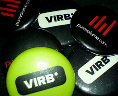
  • Keep your CSS styles and page information seperate, so you're not messing about looking through all your code just to change one bit of information.
  • Drag & Drop layout editor. Put things where you want them.
  • Blog importer. Within 30 seconds, my Yellow Shoes posts were all on my Virb profile.
  • Random tagline.
  • Text-based ads, at the bottom of the page.
  • Pretty easy to navigate and find what you want.
  • "Remove Customization" button on every page - never have to try and squint to read text again!
These pretty much all just serve to show how crap MySpace actually is!

Love, Love, is a Virb, Love is a doing word.

After my huge, plate-throwing big-row with MySpace (with no breakup sex, I'm glad to report), our on and off relationship is now officially ended. I've been looking for something to fill the void, and I think I might have found it just now whilst browsing websites that link to Yellow Shoes. This post mentioned a place called virb, which rang a bell - I was reading Computer Arts in WH Smith about a month ago, and thought I read something about it. Of course by the time I got back home, I'd completely forgotten the name of the website, and after a frantic search through the usual suspects, could find nothing of this amazing place hailed as a designer's dream.

A cursory glance through the site seems to confirm a fairly happy community, and they really do try and promote good design, which is really important to me - I won't lose sleep if I never saw another animated background proclaiming this profile to be "pimped" (which I've accrued enough knowledge by now in my life to know means it will look like a cat shite on it, and that the owner of said "pimped" profile will generally be at best illiterate, and at worst, a scally.)

I'll take a better look around the site when I am less tired and have more time, but it's already looking like Virb could have what I want in a social networking site: a friendly place that's still visionary, and that I can put my own mark on. At first glance it looks like Virb is a MySpace for the grown-up generation.